 1. it was easy but still a little difficult because you have to find the right images and sizes
2.Making the shapes and buttons/interface of the menu' 3.Finding images and text for the menu 4.Because they are generic and can be found in real life.
0 Comments
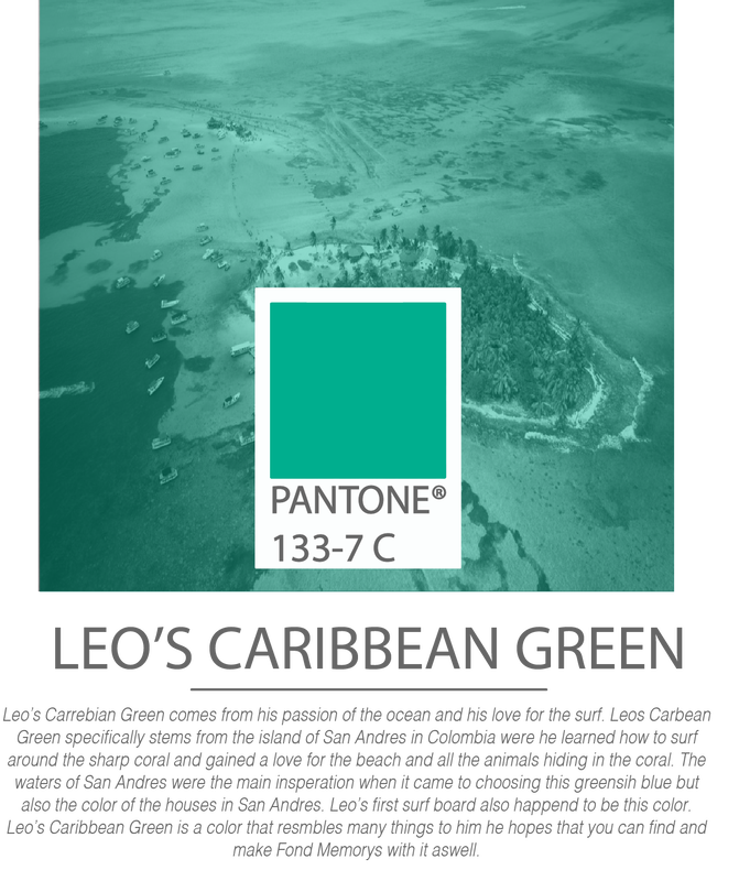
  The purpose of this Infographic is to show people a captivating photo to grab the reader in this could include information, with with even more detailed information below. The first infographic definitely has all 5 attributes of a great infographic, while the second one is missing contrast and maybe even relevance the photos are very intriguing but the writing and meat of the info is lackluster and kind of boring. When creating my own infographic I will try to have a major draw in like a captivating photo with light informations to produce Hierarchy within the infographic pushing people to get to the meat of the information, trying to avoid what the second infographic I will make the info appealing, easily digestible and overall entertaining. Im also gonna use smooth and contrasting colors from Pantone to make sure my infographic comes out clean and professional.
I chose being Radiologist and the base salary is 78,780, I would live in California and the tax for my salary would be 9.3% or 7,090$. My federal tax burden is 22% which would be 17,331$. I will end up with 4,529$ per month after taxes. When adding bills like rent, phone bill and car bills I would be left over with around 1,800 dollars a month. Which is definitely enough for me to eat, save money and invest. While the taxes are quite high in California I can still live comfortably here, although living in a different state would give me more breathing room even living in Florida I would have around 2500 left over a month. 5 things state and federal taxes pay for are Public Schooling, Healthcare, Highways, Social Security and Military.
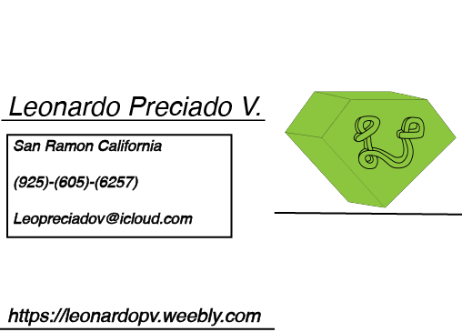
1. My logo reflects me because It has the diamond which represents security and value while the LP represents me and my family legacy
|